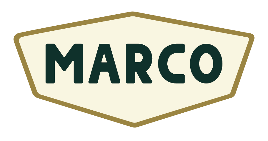
Marco Hat Company
United States | Florida
2026
The Challenge
The local hat market is saturated with brands leaning on coastal clichés and generic outdoor aesthetics. Standing out requires a brand that feels instantly established and elevated; more than just another logo on a hat.
The Goal
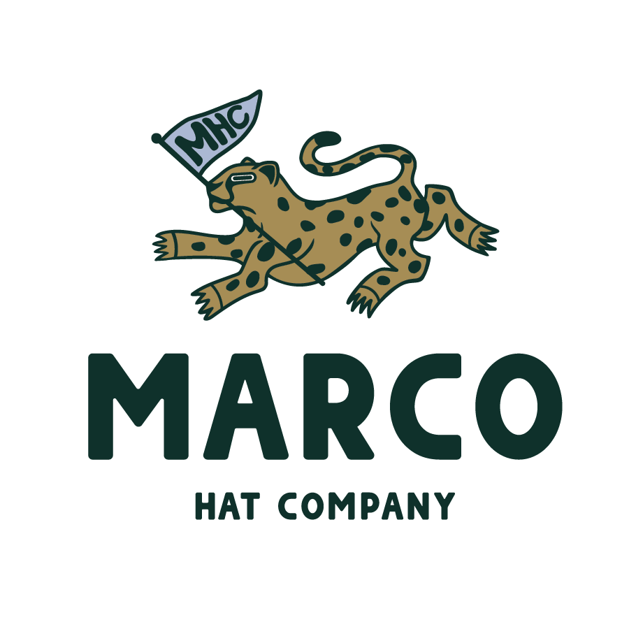
Create a distinctive, premium logo system for Marco Hat Co. where the branding itself becomes the main selling point. It needed to blend traditional Americana, front porch leisure, golf culture, and Western influence, while still feeling unique.
My Approach
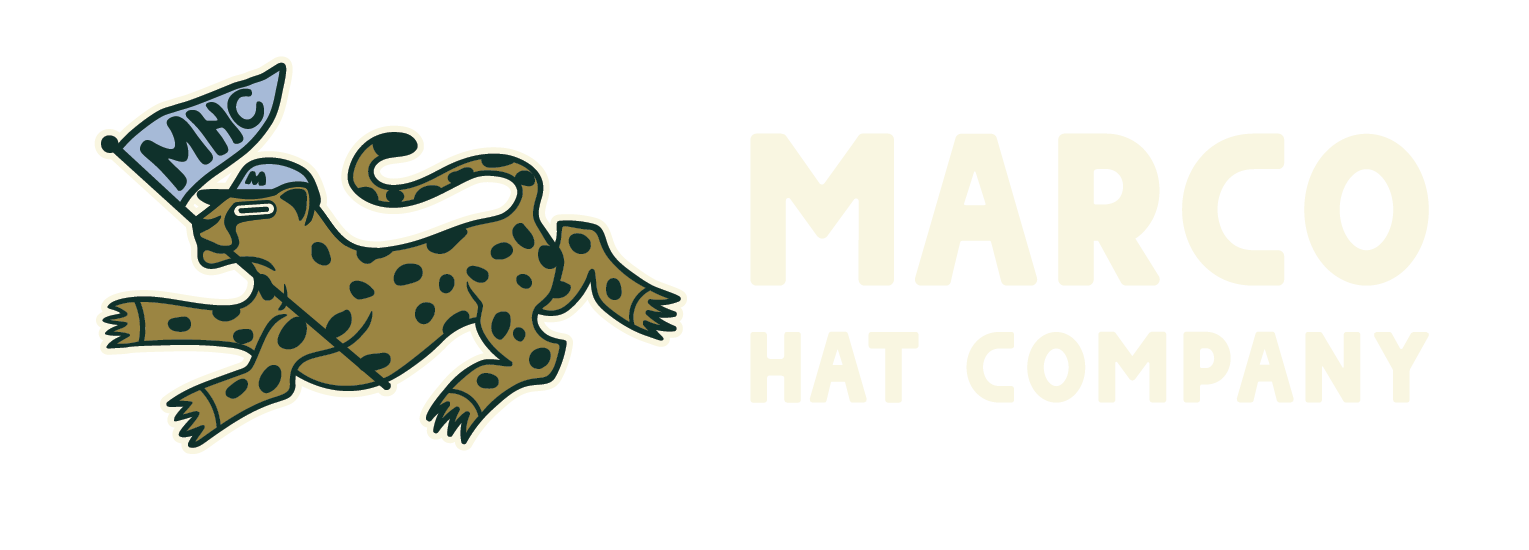
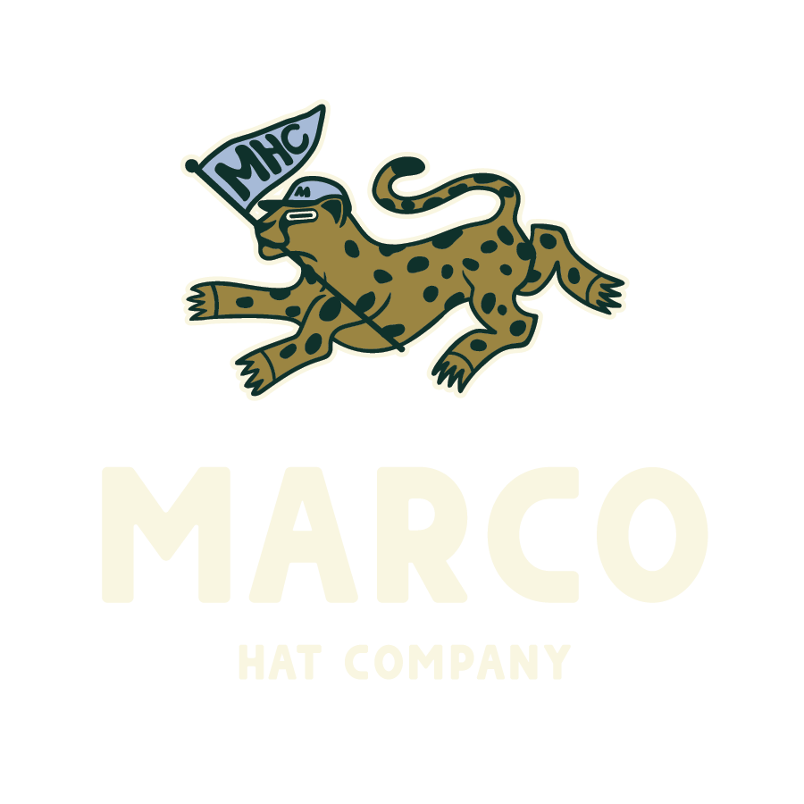
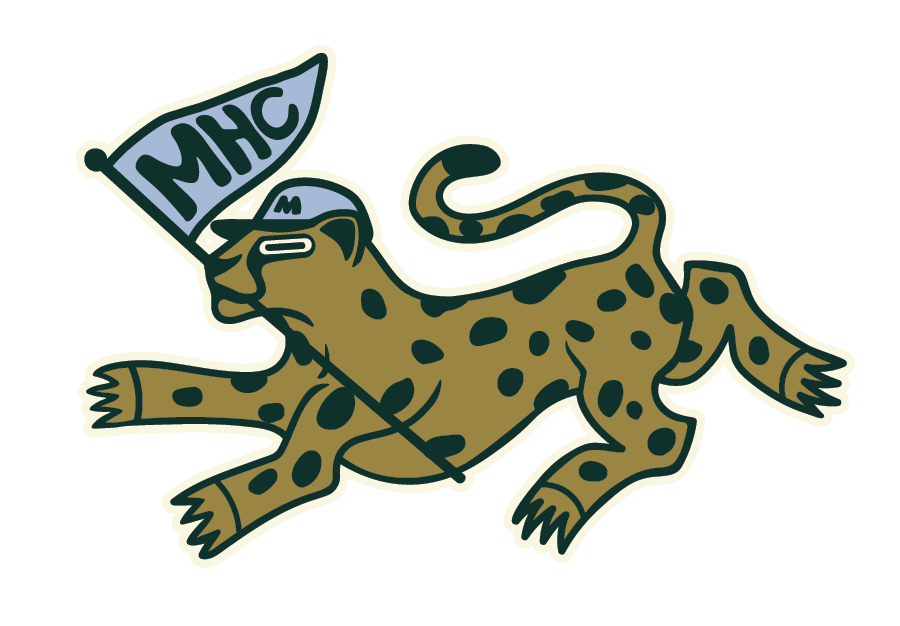
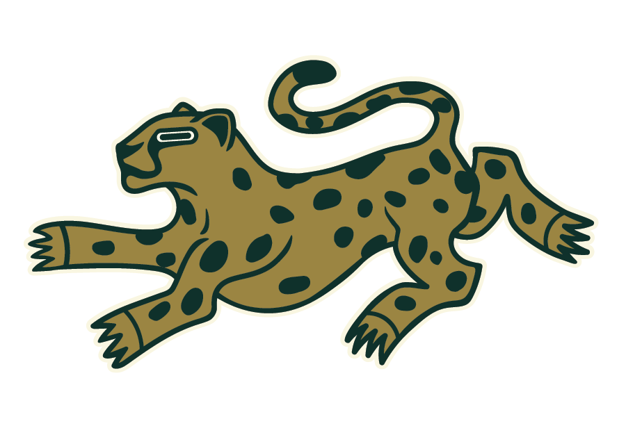
I designed a custom, hand-drawn cheetah mark in an American traditional style—unexpected, but memorable and ownable. To balance personality with performance, I focused on:
• Bold, clean linework for embroidery and small-scale clarity
• A limited Pantone color palette for production consistency
• Vector-based systems and processes for scalability across all applications
• A cohesive blend of Southern, golf, and Western visual cues
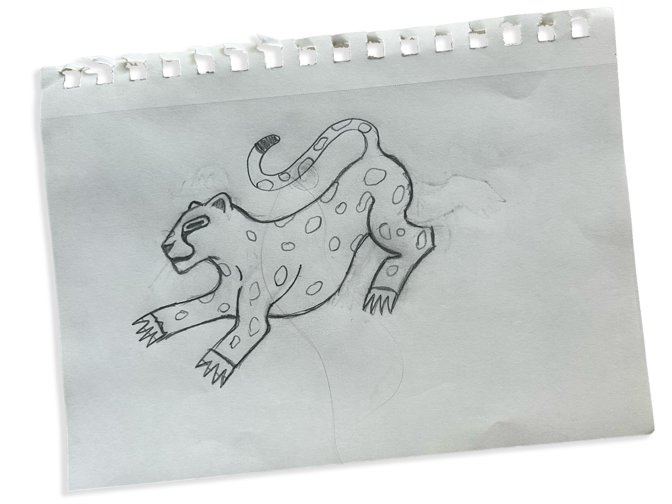
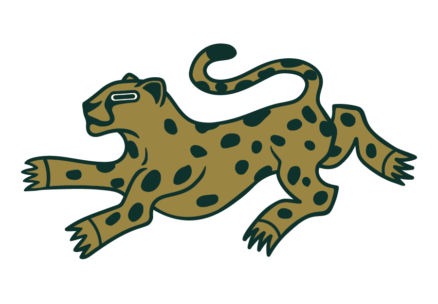
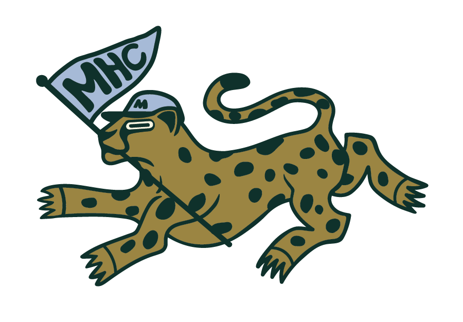
Creating a Concept
After mood boarding and brand research, I started by hand, sketching three fully custom logo concepts centered around the cheetah. These each presented different movements, character, and styles. It’s extremely important to me that my logo design process is completely human-made and original, so the final logo is not only distinctive, but built for confident trademarking and long-term brand ownership.
Refining the Concept
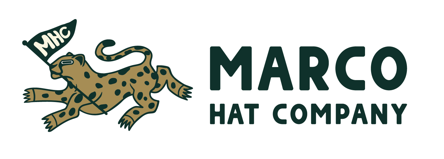
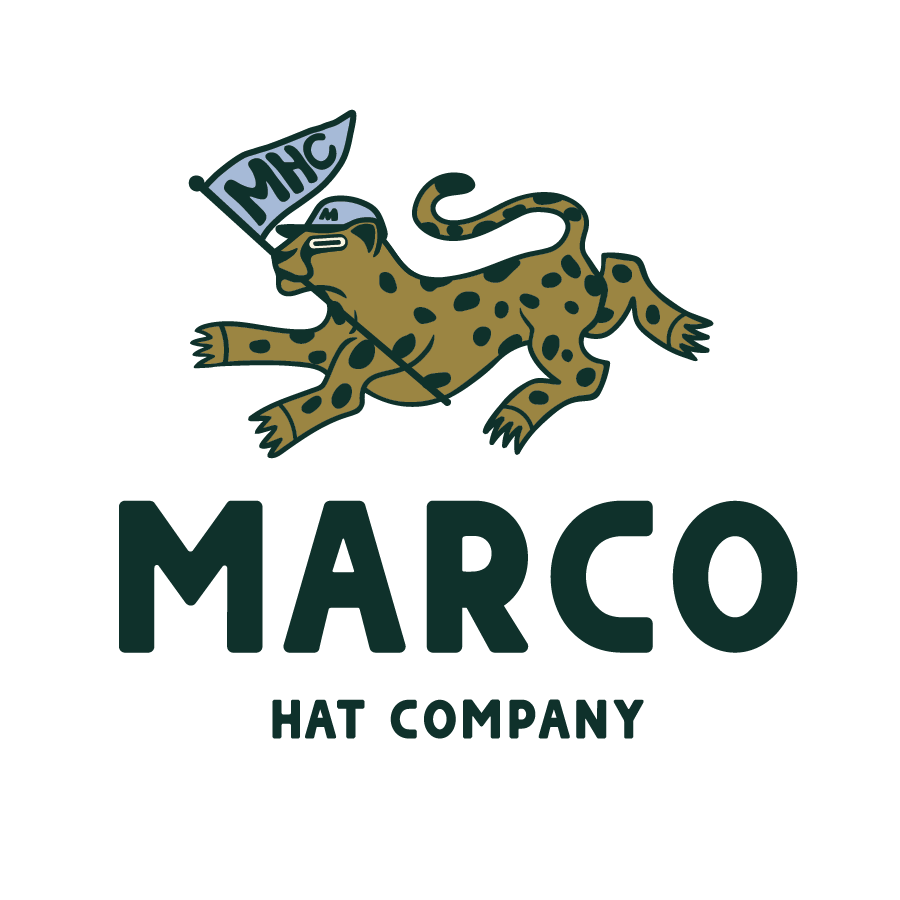
Once the client had time to sit with the three initial logos, I brought their chosen top concept into Adobe Illustrator to vectorize, develop it further, and refine the line work. I also explored typography in depth, developing strong word marks that matched the brand’s tone and paired seamlessly with the icon.
This is the step where we ensured that we liked all elements of the logo together, including typography, color palette, and primary icon.
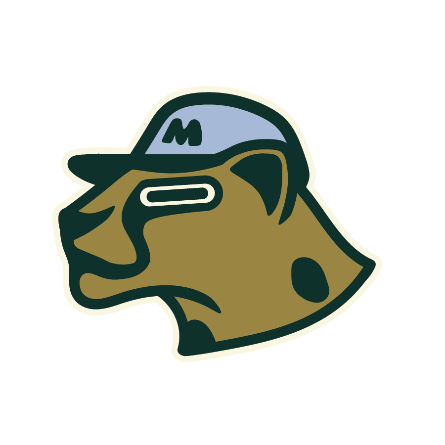
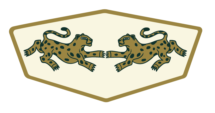
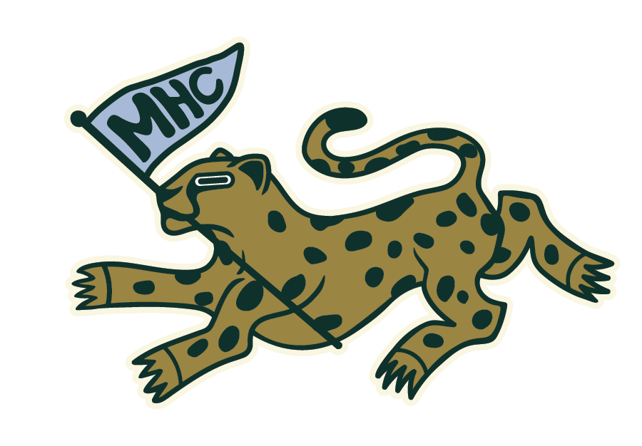
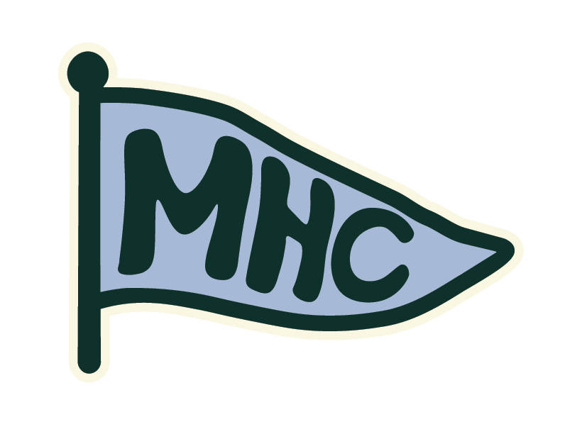
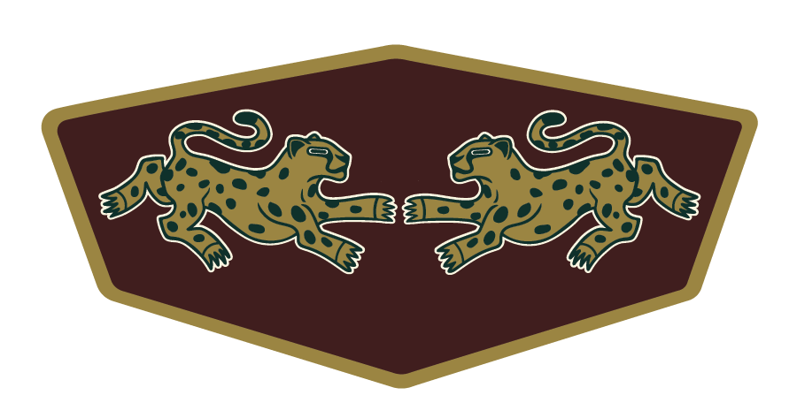
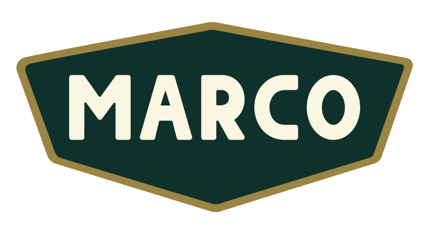
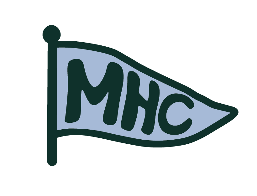
Logo Variations
To make the brand as versatile as it is distinctive, I developed an extensive suite of final logo variations—giving my client a full toolkit of cohesive assets to use across every hat style.
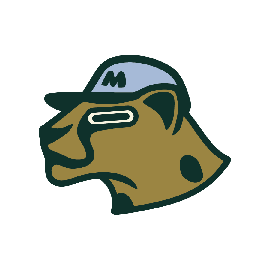
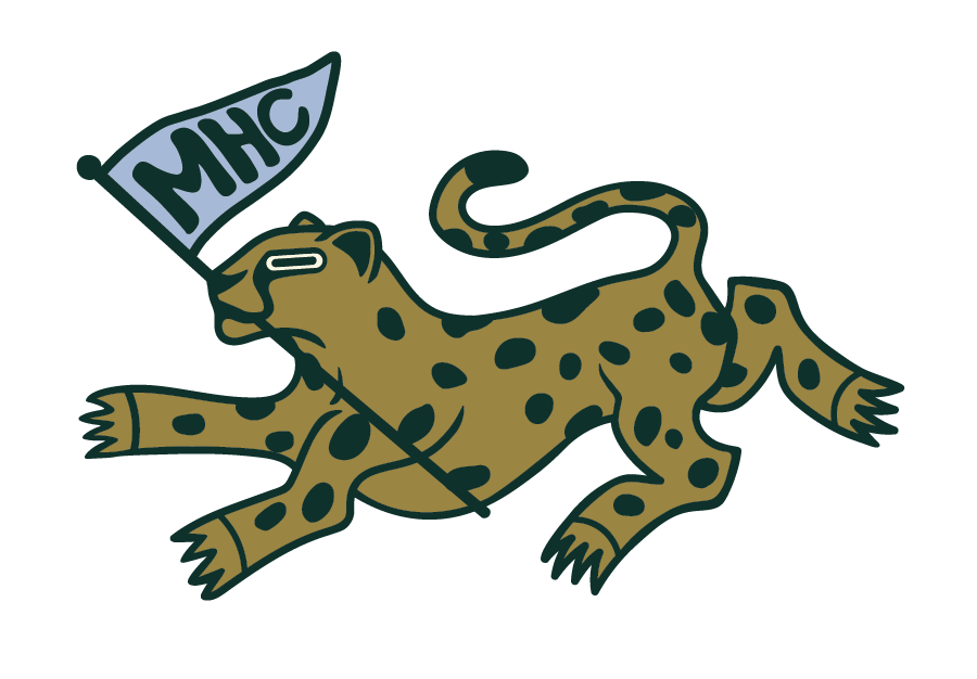
This included custom icons like flag marks and a cheetah head with a hat, multiple wordmarks, patch-style designs, and a wide range of color variations to create highly customized looks. Every variation was built with consistency in mind, ensuring they all feel unmistakably part of the same brand.

Dark Mode Optimization
I also created dark mode versions of each logo variation, doubling the flexibility and making it easy to apply the brand across different materials, colors, and production styles without losing impact.