Teton Bros
United States | Japan
2025 - Present
The Challenge
Translate a highly technical, Japan-based outdoor brand to a global audience without losing its quiet confidence and design-forward identity. The existing visual language felt premium but insular; not always legible to new customers unfamiliar with the brand’s philosophy. They also needed help with applying better email best practices for visuals & delivery.
The Goal
Position the brand as both technically elite and aesthetically intentional, making the product story accessible without flattening its cultural nuance.
My Approach
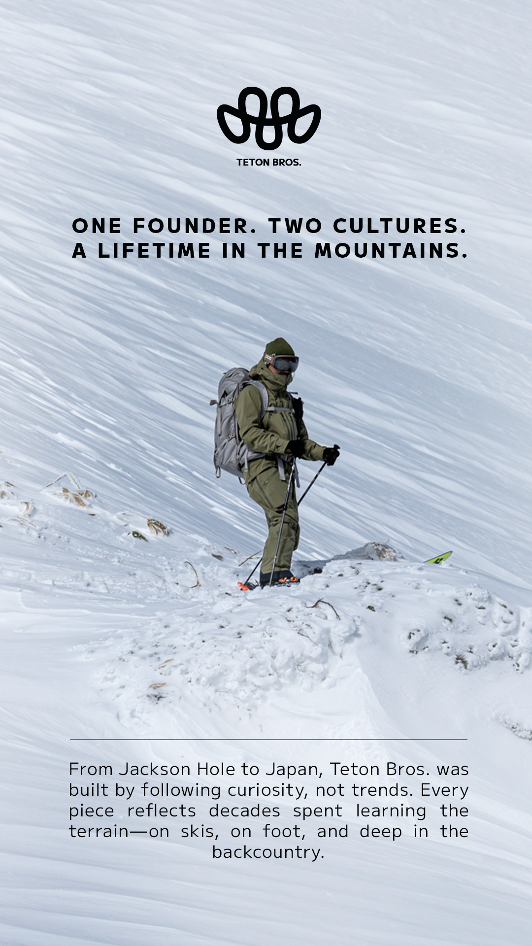
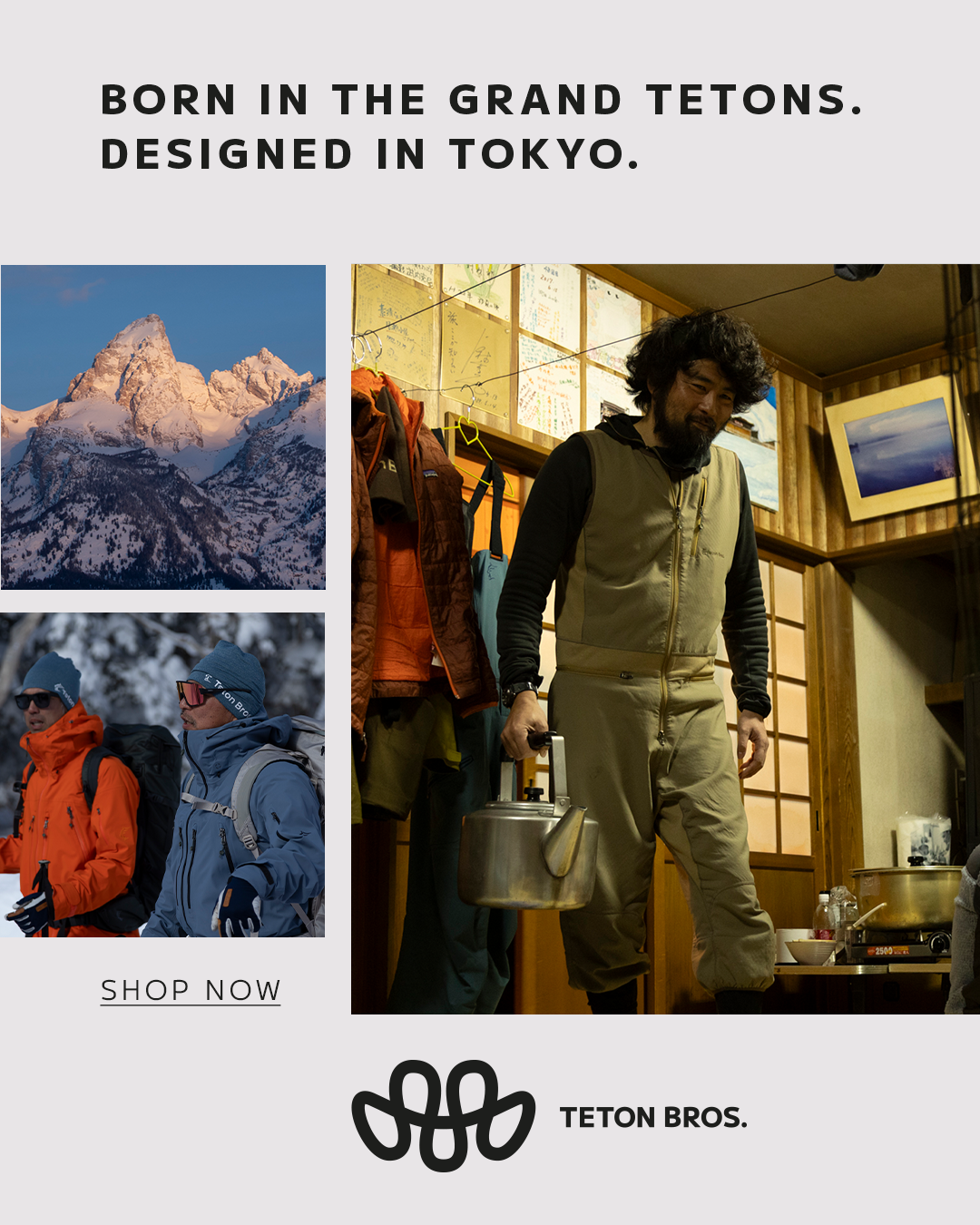
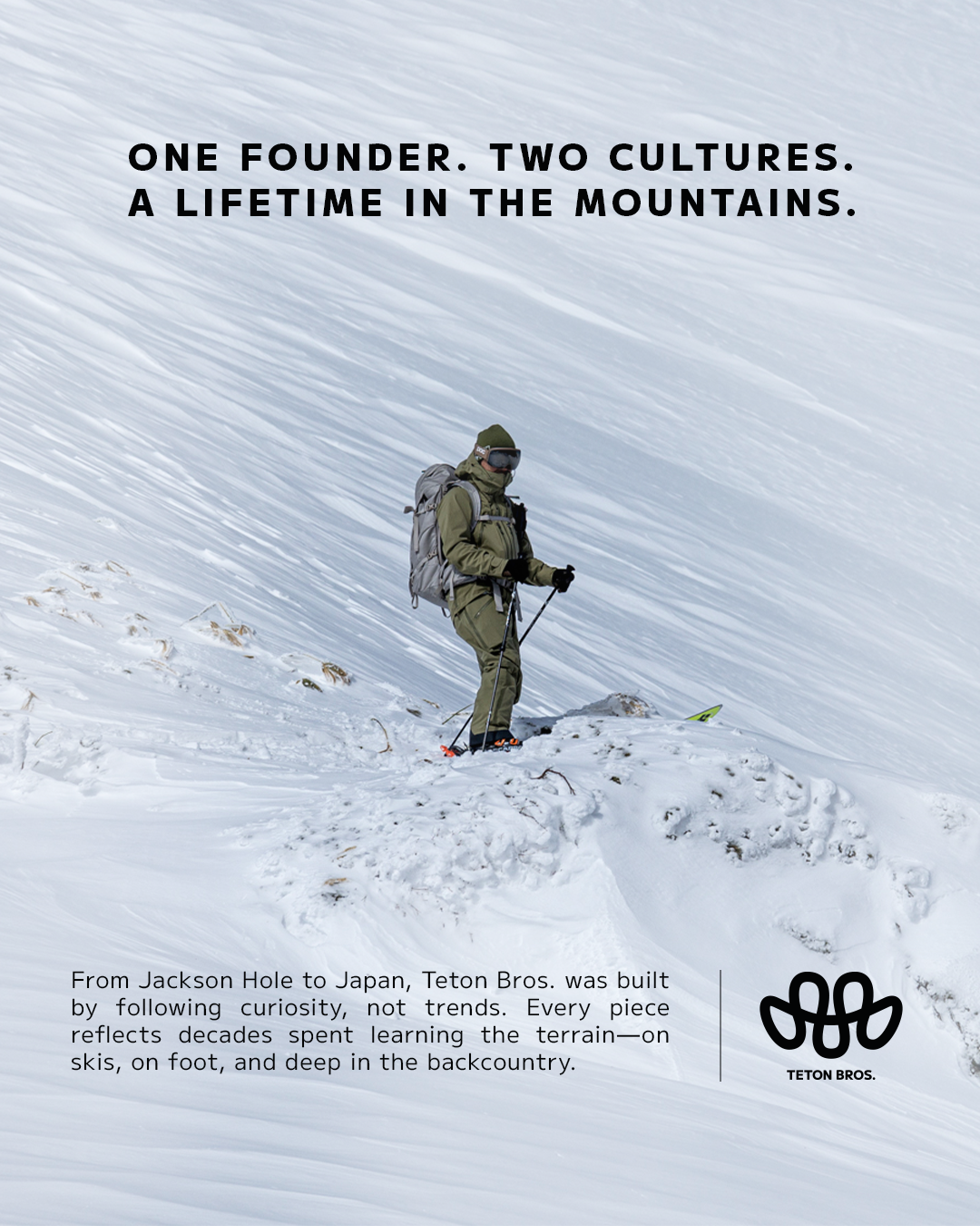
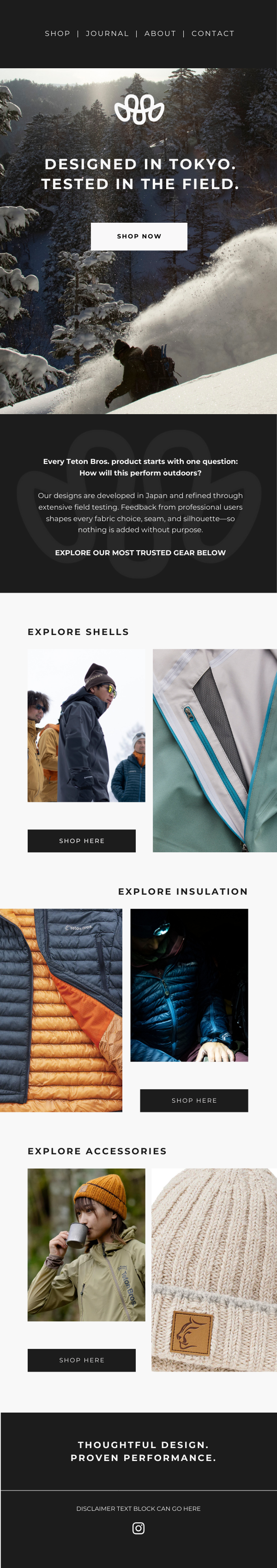
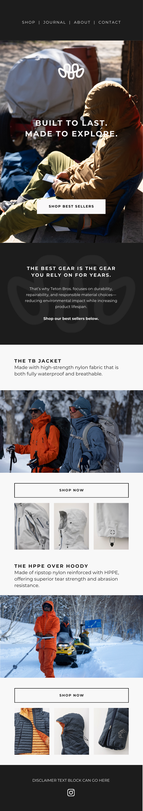
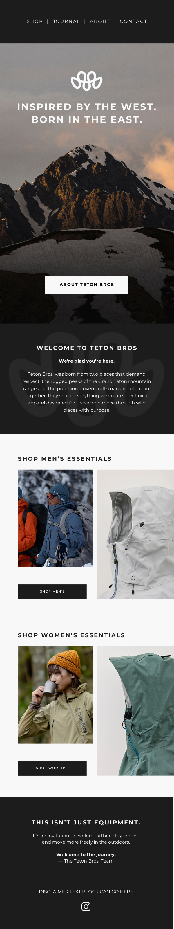
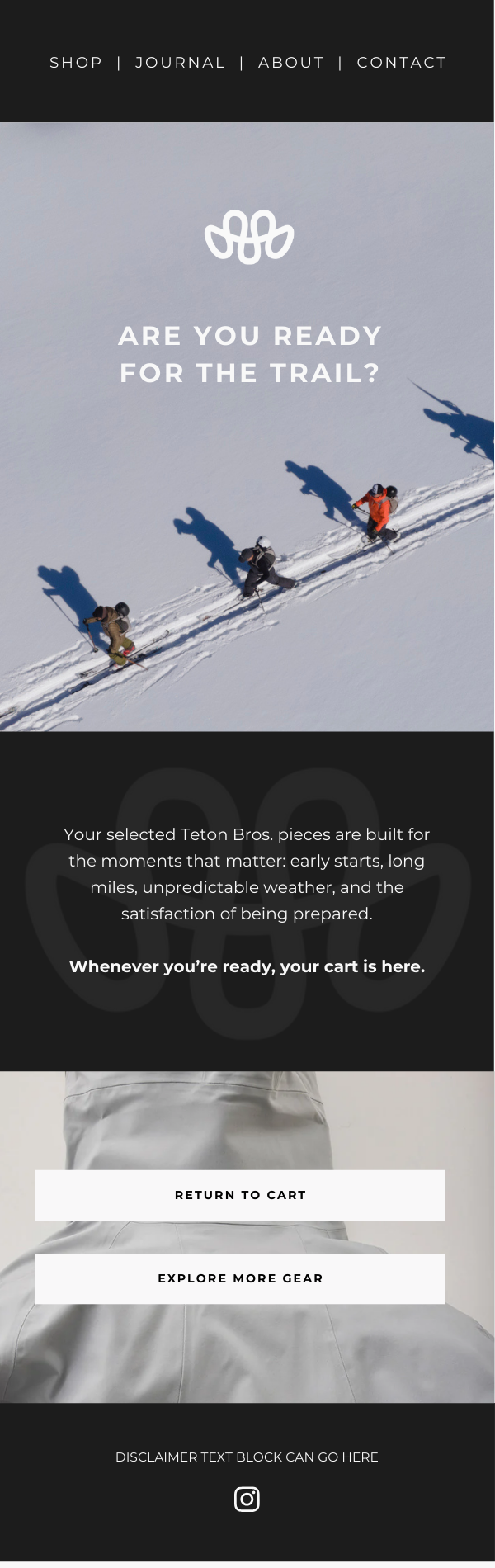
I built a visual system for both email and paid social campaigns that leans into restraint and clarity, using editorial layouts, product-forward storytelling, and negative space to elevate the brand’s quiet confidence. The work emphasizes performance through detail rather than hype, inviting new audiences in without diluting the brand’s identity.
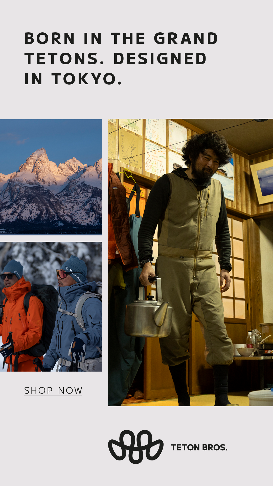
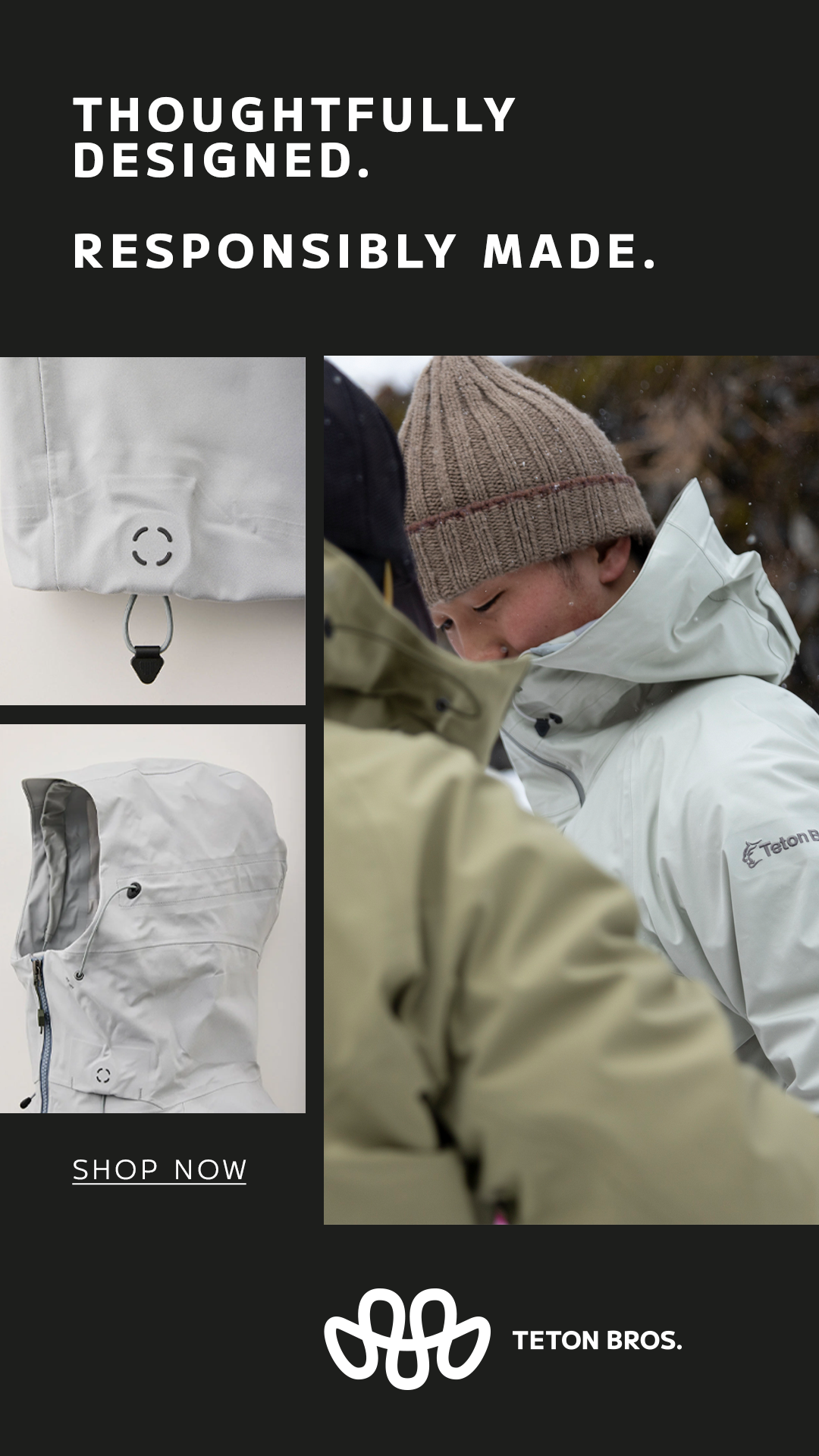
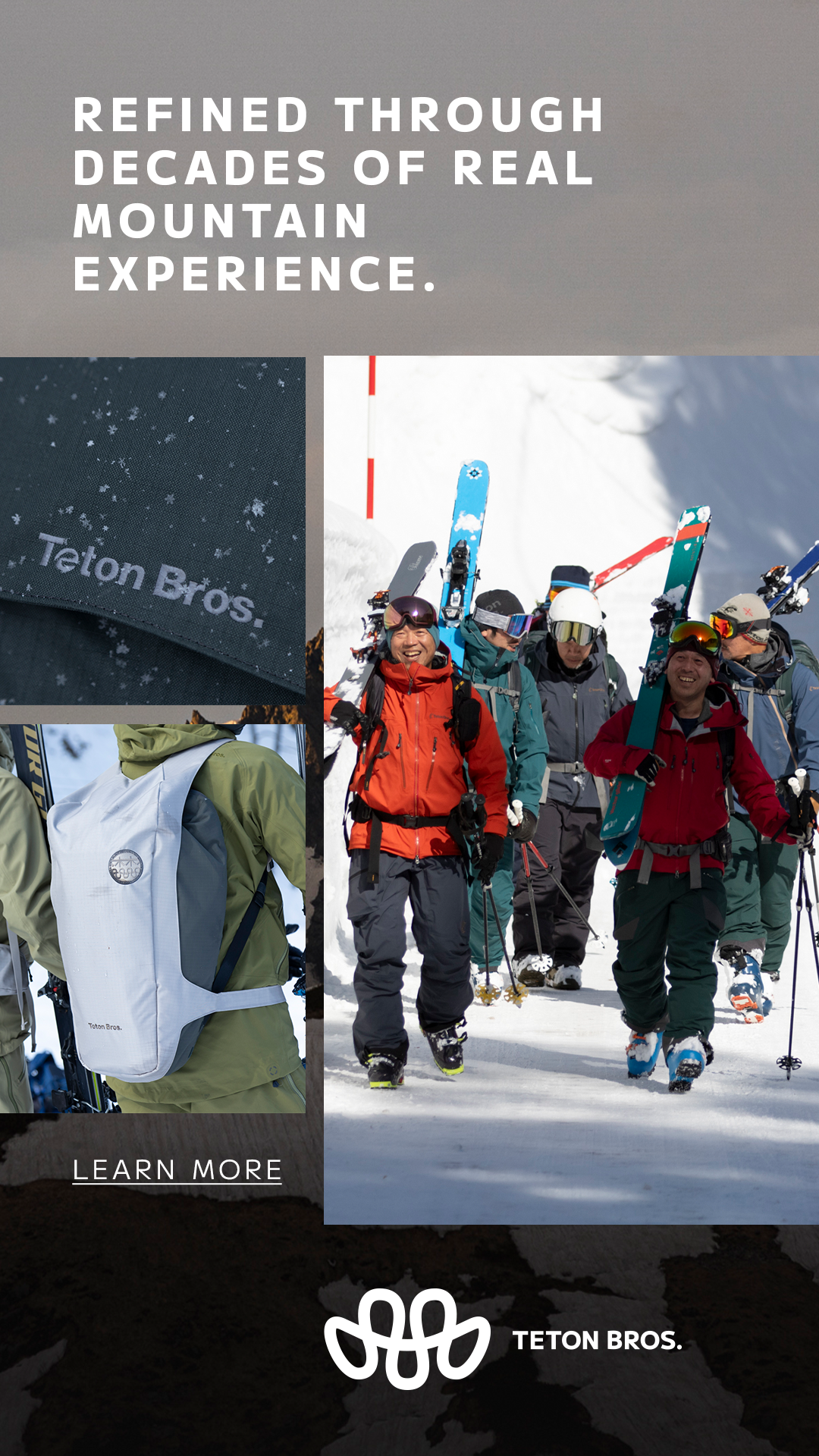
Project contracted through Surf and Snow CollectiveEmail Design
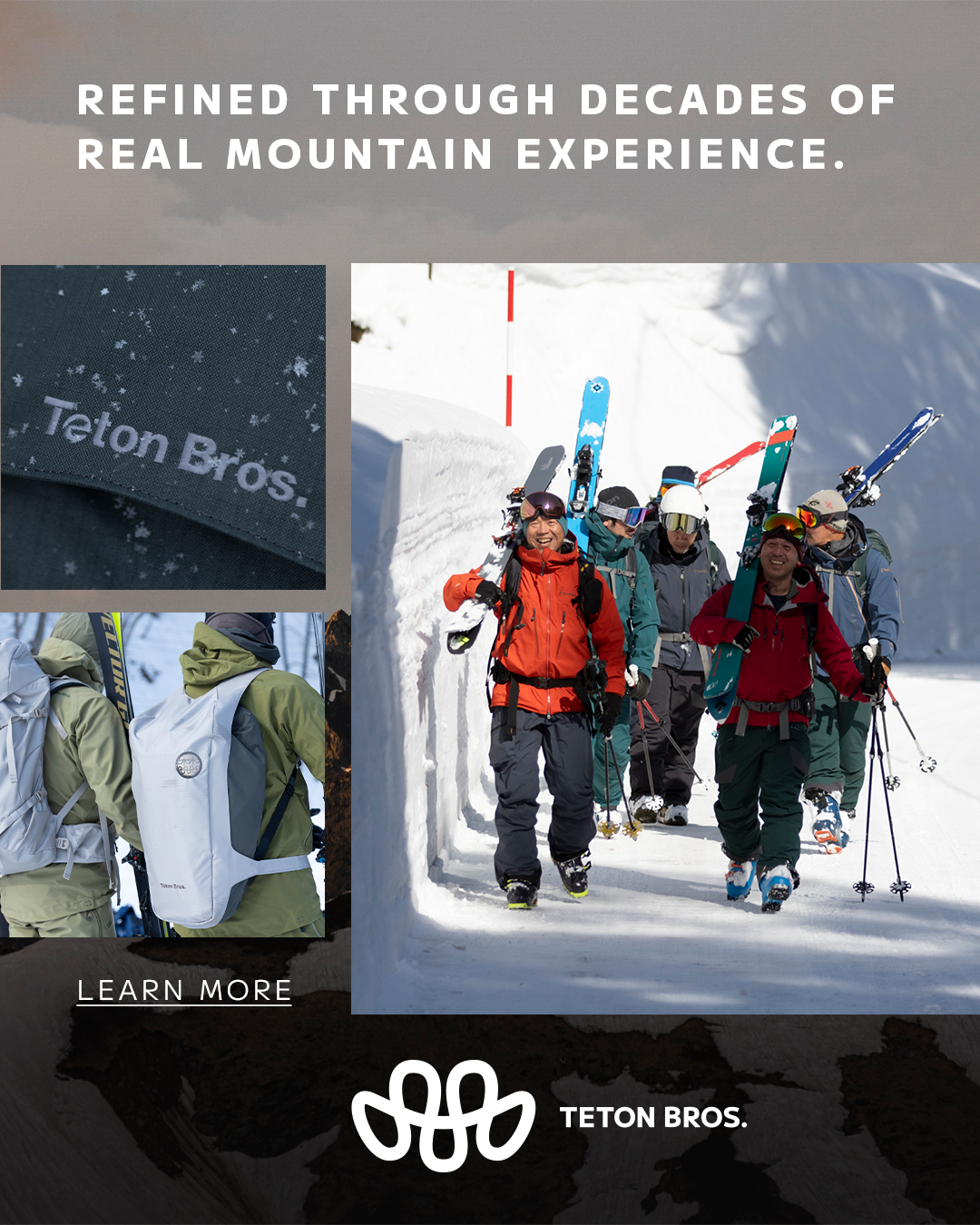
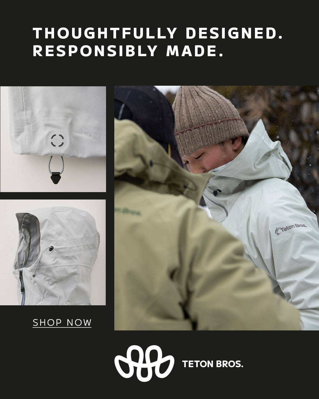
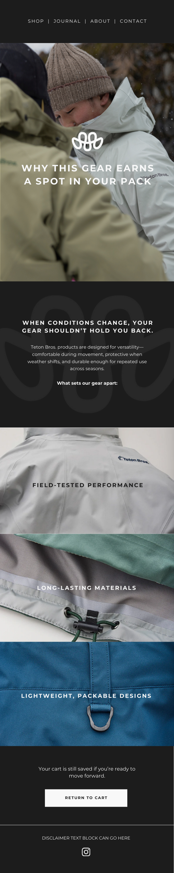
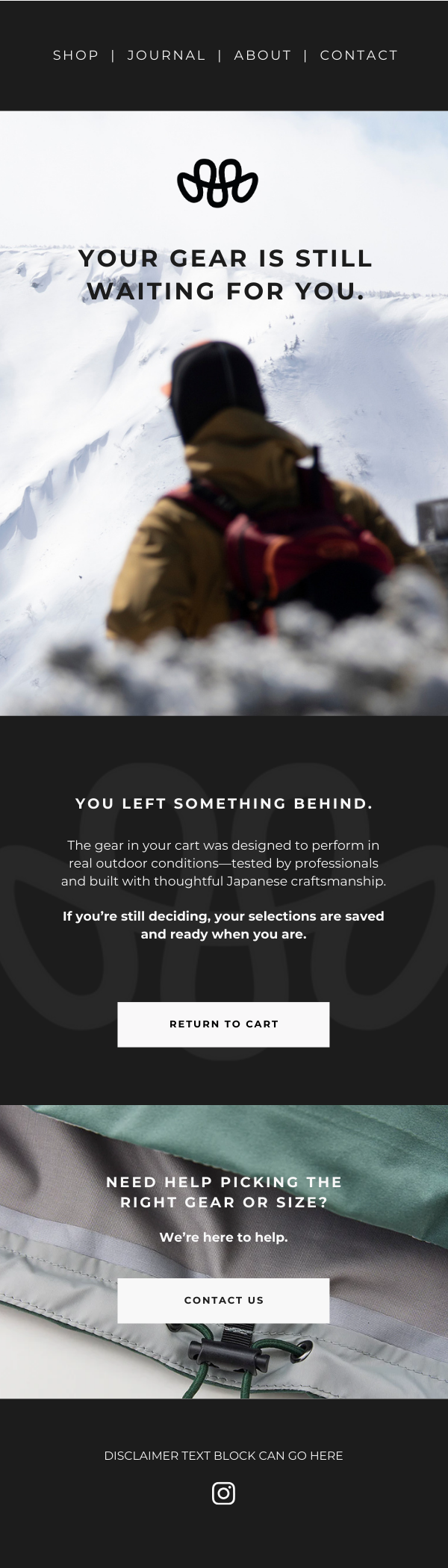
For Teton Bros., I design and wireframe emails with a minimal, product-first layout that mirrors the brand’s restrained aesthetic. My copy stays quiet and intentional—supporting the imagery, materials, and performance details without ever over explaining. The focus is on flow, clarity, and creating an experience that feels as premium as the product itself.
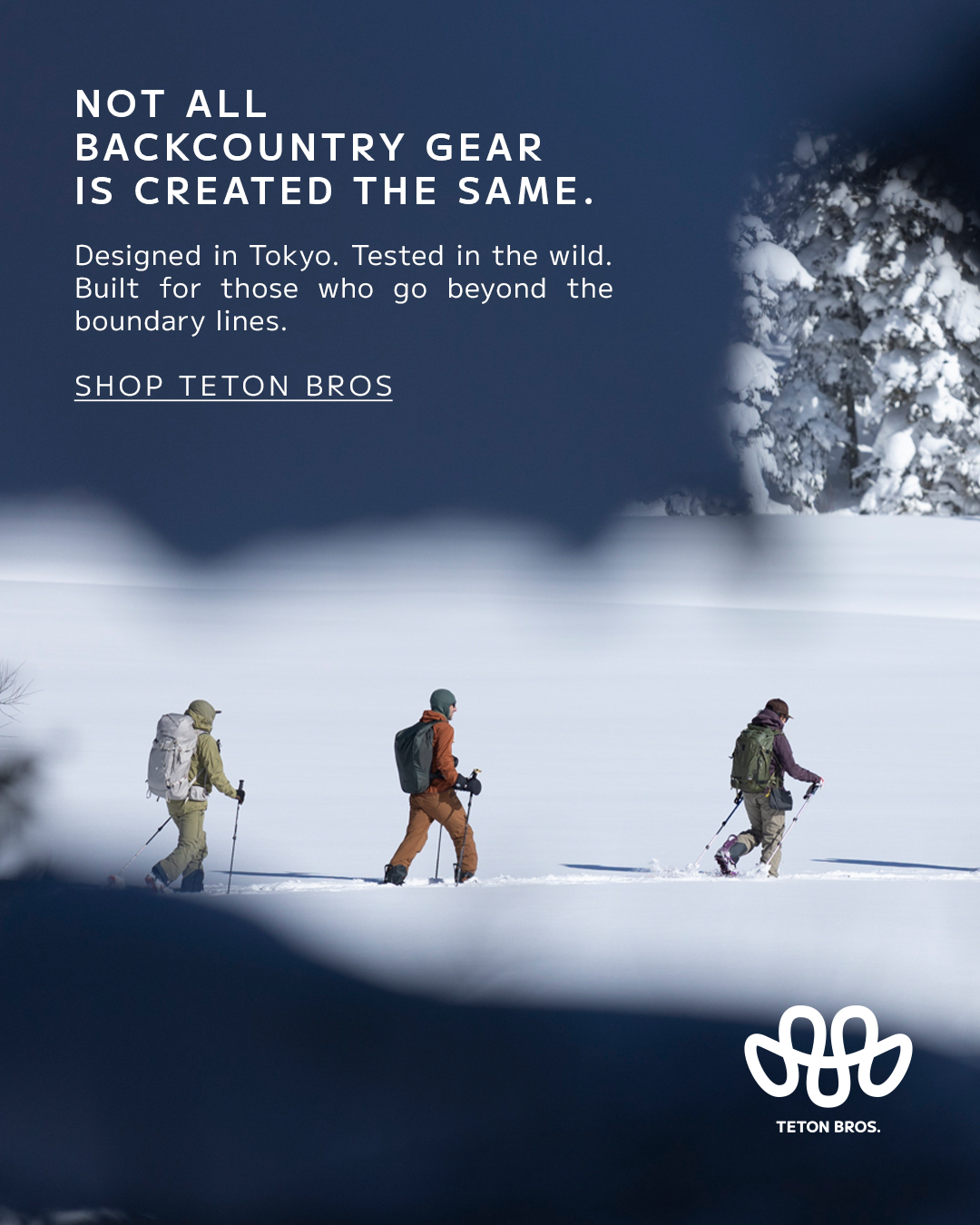
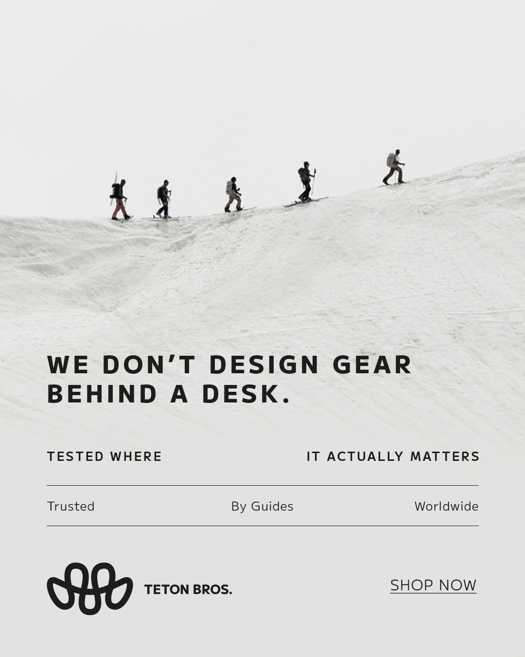
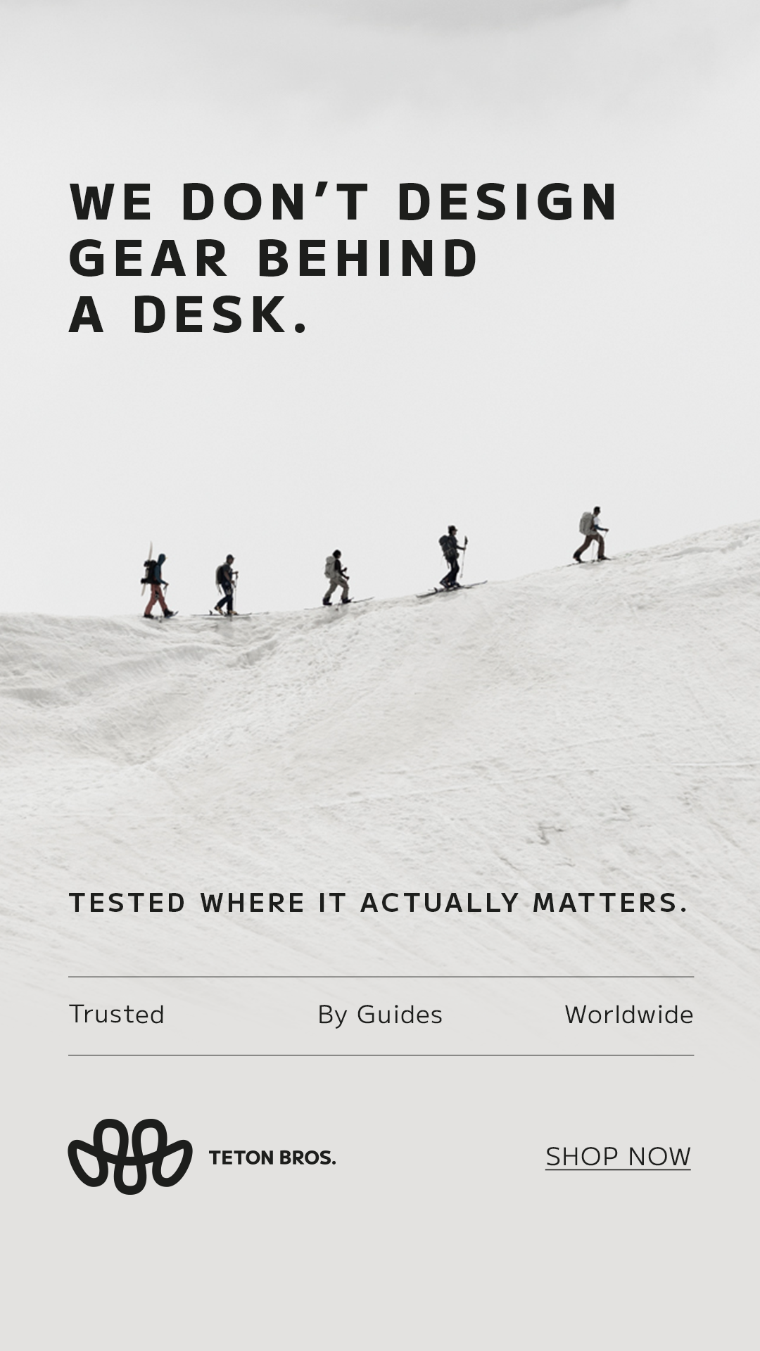
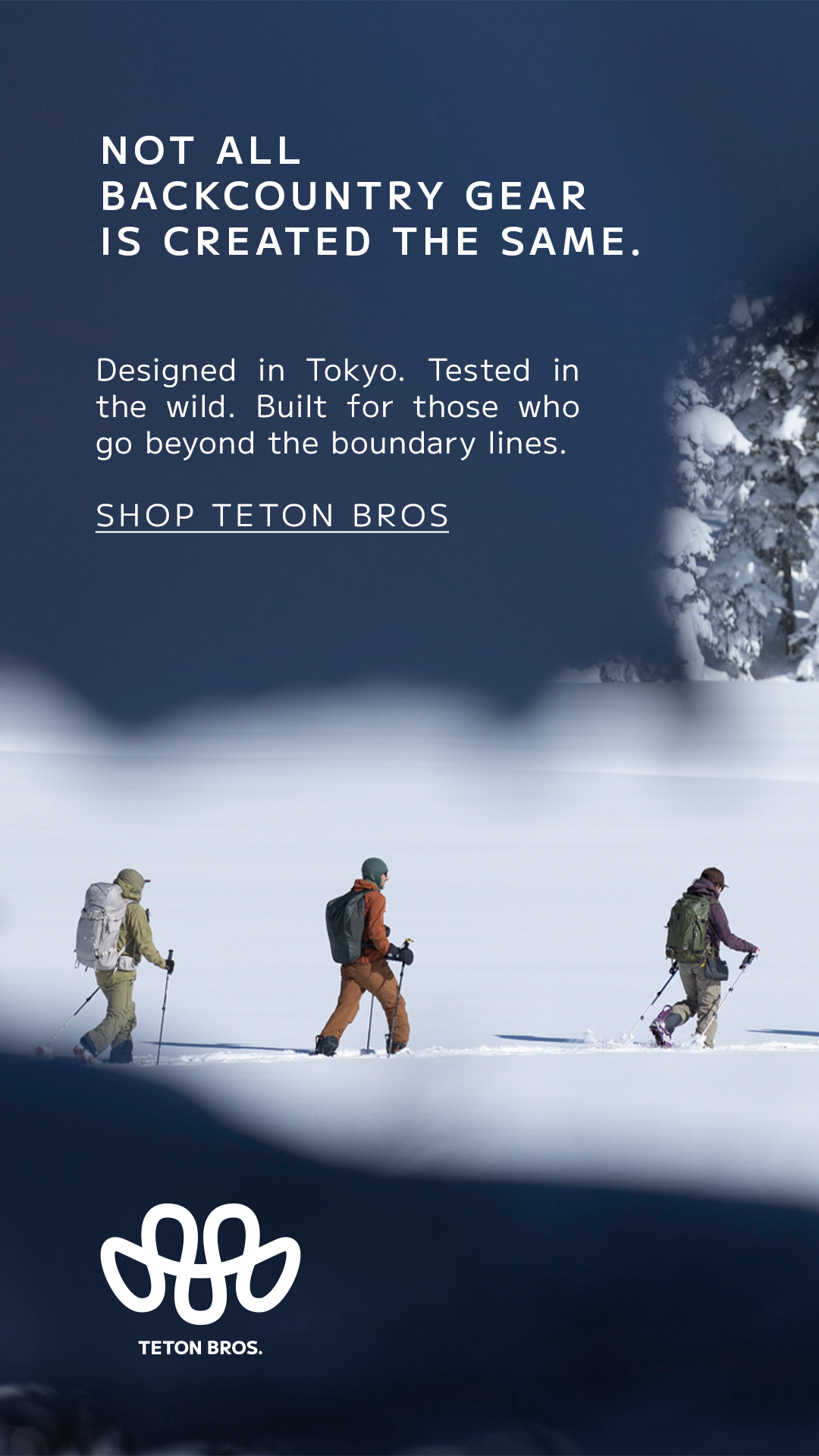
Meta Ads Banners
I design Meta ad creative for Teton Bros. with a stripped-back, product-forward approach that feels native to the brand. The layouts prioritize environment, movement, and material details—creating scroll-stopping visuals that feel refined, not loud, and stay true to the brand’s understated tone.